

When Pantone announced its Color of the Year 2026 (check out my blog post exploring the real meaning behind the Pantone Color of the Year), the reaction online was far from mild. Many design enthusiasts went as far as calling Pantone’s pick outright rage bait, arguing that a “non-color” hardly feels worthy of a Color of the Year title. The choice simply didn’t resonate with what people have been gravitating toward for years. Because let’s be honest: the collective call for green has been loud, steady, and incredibly consistent. And there’s a reason for that. Green is the perfect colour for turbulent times — it calms our nervous system, brings a sense of grounding, and simultaneously helps us maintain clarity and focus. In a world that feels overstimulating, green offers a rare duality: emotional serenity and mental sharpness. No wonder so many of us want to come home to it.
Unlike trend colours that surge and disappear, green feels almost biologically right. Our brains are wired to respond positively to it — it’s the colour of life, growth, fresh beginnings, and balance. When everything around us speeds up, green acts like a visual deep breath. And that’s precisely why it has become the new “neutral” for so many people: it supports our wellbeing without overwhelming the space or dictating a specific style.
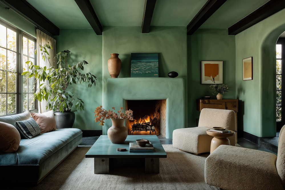
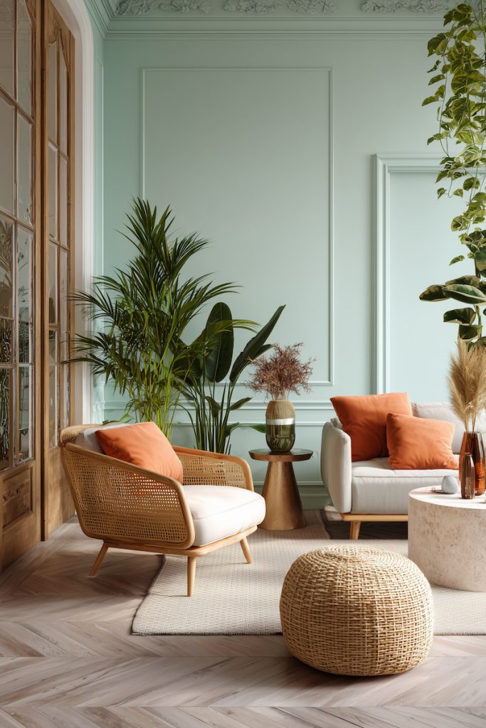
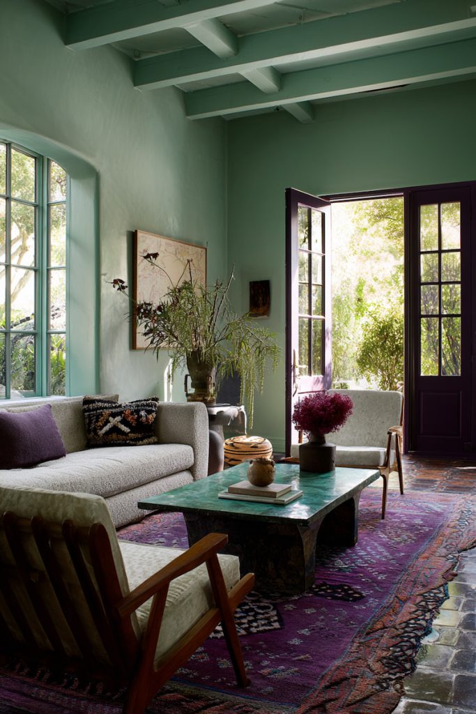
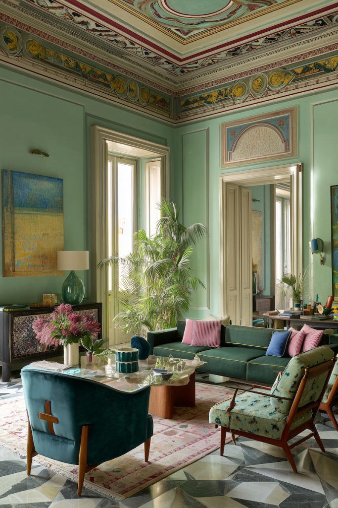
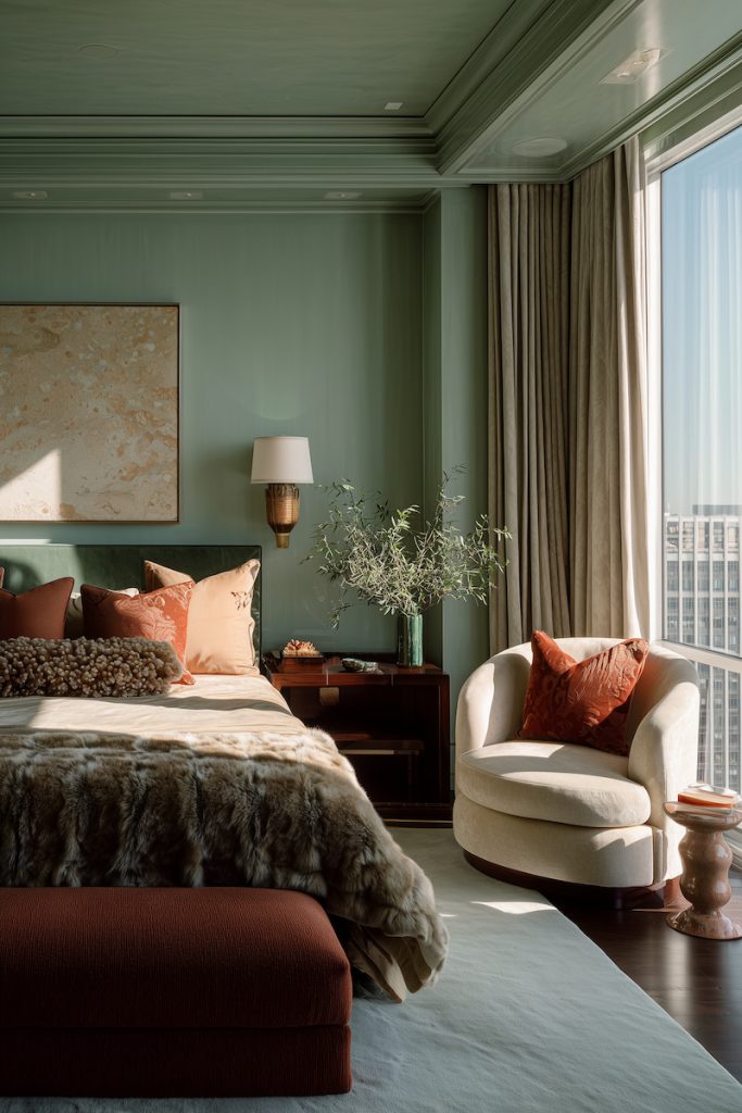
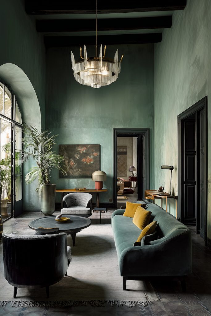
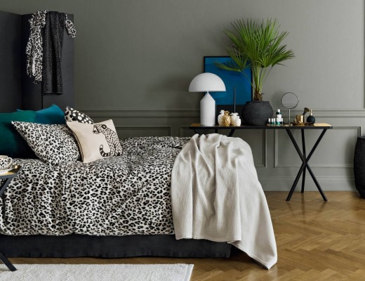
What makes green even more powerful is its extraordinary versatility. While it may not be considered a “classic” neutral like beige or grey, muted and softened greens behave in exactly the same way — only better. Dusty sage, soft olive, pale pistachio, or grey-green tones adapt beautifully to nearly any environment. They can warm up a cold, modern interior or bring sophistication and depth to a more traditional one. And unlike many neutrals that risk looking flat or uninspired, green adds character and dimension while still keeping the atmosphere calm and cohesive.
Another reason green works so well today is its ability to bridge different styles, budgets, and levels of design experience. You don’t need a perfectly curated home or designer furniture to make green shine. It works just as beautifully in a 100% IKEA apartment as it does in a renovated historical home or a luxurious palatial interior. A muted green wall can elevate even the simplest room — making it feel more intentional, more designer-like, and more serene at the same time. This democratizing quality is one of green’s biggest strengths: it makes any space feel richer without becoming demanding.
Below is a series of interiors demonstrating just how universal green truly is. From soft, powdery pastels to deep, moody forest tones. From warm pistachio hues to intense blue-green shades. Each example highlights a different style, showing how remarkably adaptable green can be. Whether you prefer minimalism, warm Mediterranean textures, modern eclecticism, or something more classic, there is a shade of green that fits seamlessly into your visual language.


Moving further into the decade, green isn’t just a trend — it’s becoming a long-term foundational colour for interiors. It reflects the emotional needs of our time while giving us spaces that feel fresh, grounded, and deeply comforting. And that’s something no annual colour announcement can override.


No Comments