This year, I’m seeing many posts across the social media, where people clearly misunderstand what the Pantone Color of the Year really represents. As someone interested in trends, I’d like to dive into it. The Pantone Color of the Year isn’t just a random suggestion to the world saying, “Hey! Why don’t you paint your walls with this great color?!” It’s primarily a reflection or forecast of global mindsets and events, translated into the language of color. In other words, it’s a trend prediction – a color that is expected to resonate with a significant portion of consumers in the coming year. Pantone analyzes social, cultural, political, economical and other factors to make this choice. “We want to ensure that the colors we select reflect what is taking place in our global culture at a specific moment in time,” explains Pantone.
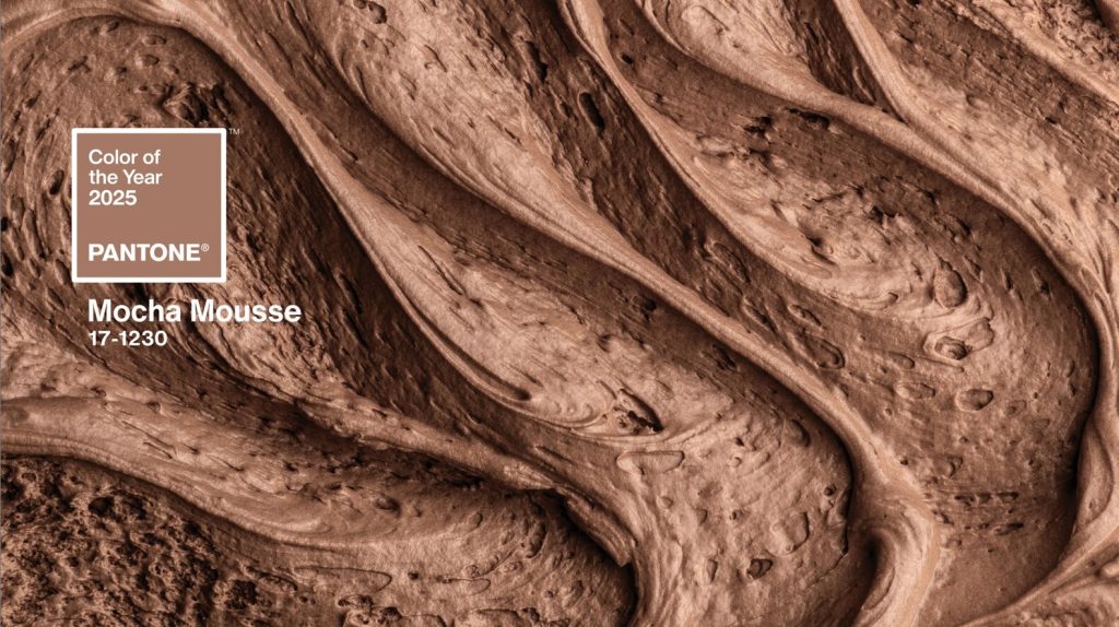
Who is the real target audience of Pantone Color of the Year?
Who is the target audience for this insight into color macro-trends? Businesses, especially those that rely on color to attract customers. This includes not only fashion but also home goods, cosmetics, graphic design, and more. While Pantone focuses on color, trend agencies go even deaper. They produce trend books where they also analyze consumer preferences in materials, textures, and finishes. Manufacturers value this information and pay for it. So, while the Pantone Color of the Year might look like a fun annual gimmick, it’s actually just the tip of the iceberg when it comes to trend analytics.
We are still in the beige phase
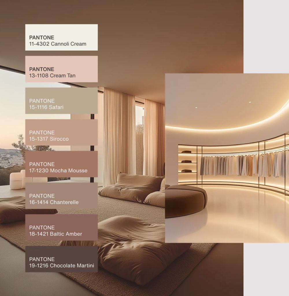
As for the newly announced color and what it means, it’s not groundbreaking. It is a continuation of the beige trend, as can be seen from the colour palette collage above, authored by Pantone themselves. Many noticed that Zara Home embraced neutrals, especially, beige tones years ago. Kave Home, a major Catalan furniture company, completely redefined its style last year. Essentially, they have gone beige. And so did their Barcelona store at Avenida Diagonal. There has also been a huge shift from vibrant colours to beige tones at Casa Decor. This is Spain’s number 1 interior design event held annually in Madrid. The first time I became aware of this beige takeover was at Casa Decor 2022.
And what does the beige trend signify? It’s our psychological response to the rising global stress since 2019. Beige represents a safe space – a mental cocoon of neutrality to avoid feeling overwhelmed. By choosing beige tones, Pantone’s choice signals that in 2025, we will still need calming, neutral surroundings.
Looking back through the lens of color psychology
This year’s color choice isn’t a big shift. In 2024, Pantone chose Peach Fuzz, another peachy-beige tone. The trend has been consistent since the pandemic began.
Here’s a quick look at the past few years’ Pantone Colors of the Year and their meanings through the lens of color neuroscience.
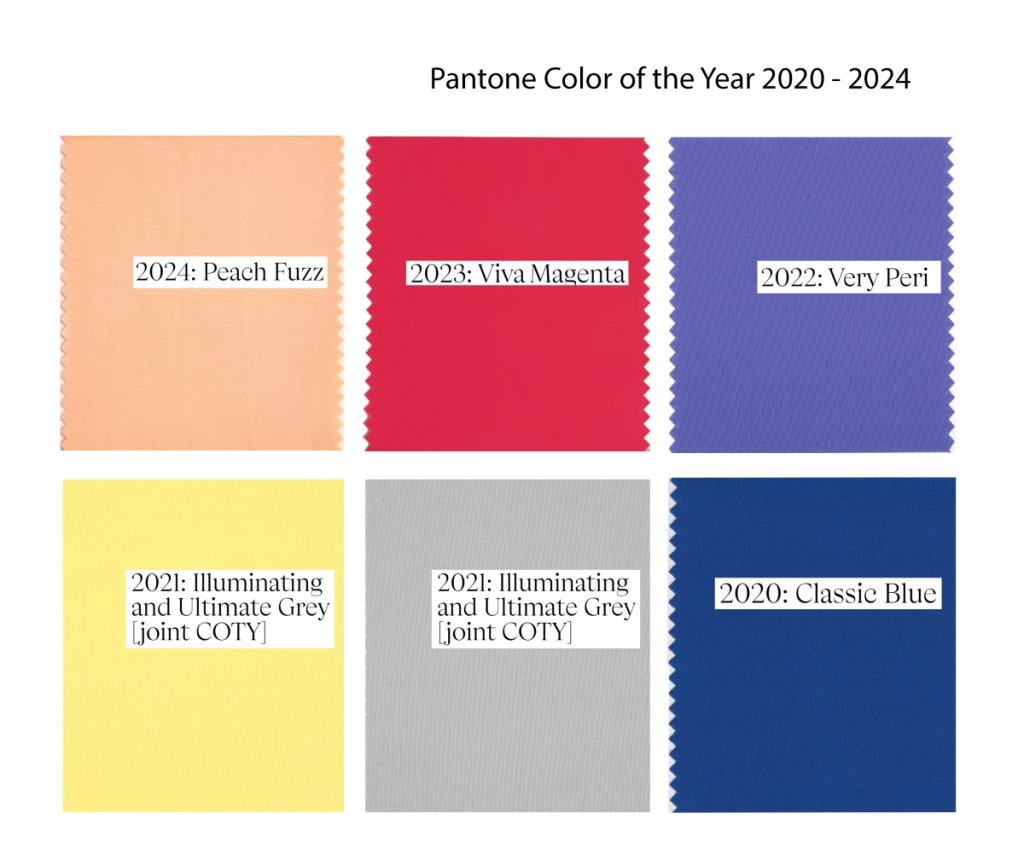
- 2020 (Dark Blue): A color symbolizing maximum calm and slowing down—essentially saying, “Rest, the bad times will pass.”
- 2021 (Yellow): A compensatory color meant to evoke joy and counteract social isolation (again, tied to the pandemic).
- 2022 (Violet): While beautiful, violet is associated in color psychology with depression.
- 2023 (Magenta red, first time I saw it I thought it was essentially the color of red meat): A reflection of the heightened aggression in the world and ongoing violent military conflicts.
In Conclusion
The Pantone Color of the Year is far more than a fleeting trend or a simple paint recommendation—it serves as a reflection of our collective mindset, influenced by the social, cultural, and emotional currents shaping the world. As we enter 2025, the continuation of the beige trend underscores a global need for calm and neutrality amidst ongoing stress and uncertainty. This color choice, like those of recent years, highlights how deeply our emotional and psychological states are tied to the hues we surround ourselves with. For businesses, designers, and trend enthusiasts, understanding the significance of these choices provides valuable insight into consumer behavior and the subtle ways color impacts our lives. Beige may not be groundbreaking, but its quiet power lies in creating spaces of safety and balance—something we clearly still crave in a rapidly changing world.




No Comments