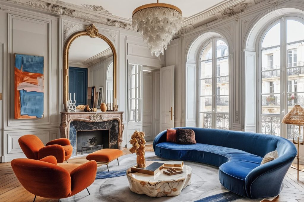
Setting the Record Straight
I’m no expert, and this post isn’t meant to promote any particular Midjourney AI course. I’ve been using Midjourney for several months now, having completed an in-depth introductory course in spring. You can check out my experiments with an eclectic Mediterranean style and a mustard-and-blue color palette in a recent blog post. I found the experience insightful, which is why I want to share my thoughts on how Midjourney can help streamline your workflow and support interior designers.
This isn’t about how Midjourney will “revolutionize” design or push creative boundaries—that hype is often reserved for people selling courses. While I’m not saying these claims are entirely false, Midjourney does have some important limitations, and it’s best to be aware of them. I’ll touch on these limitations briefly and, hopefully, they’ll be addressed in future updates.
Why Midjourney?
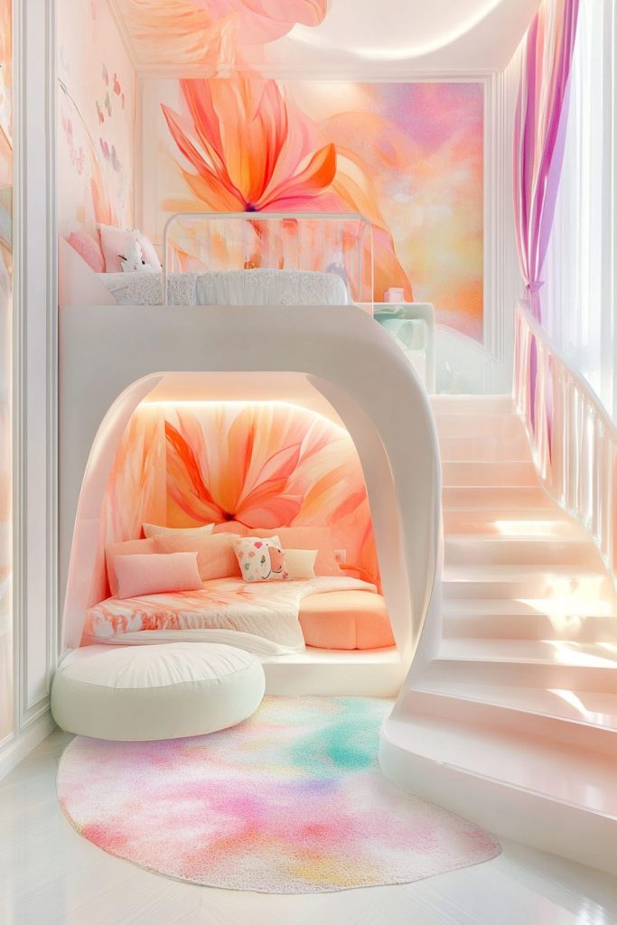
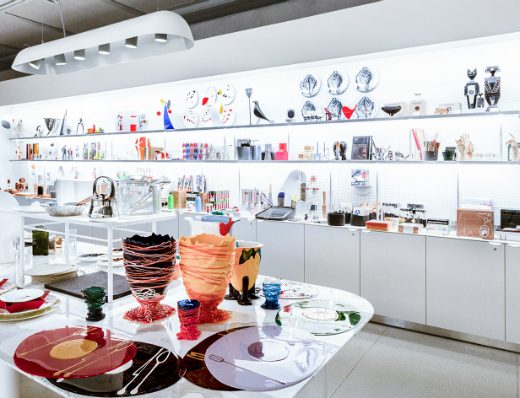
With so many AI image-generation tools out there, why choose Midjourney? In short, it’s about versatility and photorealism. Midjourney can recognize and replicate a wide range of artistic styles, from Van Gogh and Matisse to renowned manga artists and children’s book illustrators. It also produces highly defined, photorealistic images—a noticeable improvement with the latest version, Midjourney 6 (2024).

Midjourney´s Key Limitations
One major limitation is you do not have full control over generation results. Unlike 3D design tools like 3ds Max, Midjourney doesn’t allow you to specify exact measurements or control every element in a picture. While some AI tools can use a 3D sketch or collage to generate a space’s basic structure, with more or less attention to detail when it comes to textures, Midjourney doesn’t offer that level of control.
The AI’s creativity is limited to the images it’s been trained on, much like a human’s creativity is shaped by visual savviness. The difference between us is that Midjourney lacks the subtlety and attention to nuances we might use. For example, if you request an accent color, the AI often applies the exact same hue throughout the image, which can make the design look flat. With a highly detailed prompt (text phrase describing what you want to see on the image), you can get a stunning result, but with generic prompts like “modern Scandinavian living room,” the output may be equally generic.
Another downside is the time and effort required to create an effective prompt. While Midjourney has a command to simplify prompts, it actually performs better with more detailed, intricate ones. There’s also a learning curve to finding the right language. For example, I discovered that while Midjourney didn’t recognize “Murano glass lamp,” it did understand “Baccarat-style chandelier.”
Finally, you will find that Midjourney can sometimes mar a nearly perfect image with small “artifacts”—generation glitches like an extra finger, a missing chair leg, or just random or odd objects. Depending on the glitch, you might be able to fix it using the Vary (region) tool, which works surprisingly well. If that doesn’t work, Photoshop is a great backup—trust me, even with limited Photoshop skills (which is my case truth be told!), you can fix a lot!
And now moving on to my thoughts on how Midjourney can be useful for interior designers.
How Midjourney Can Be Useful for Interior Designers
1. Mood boards
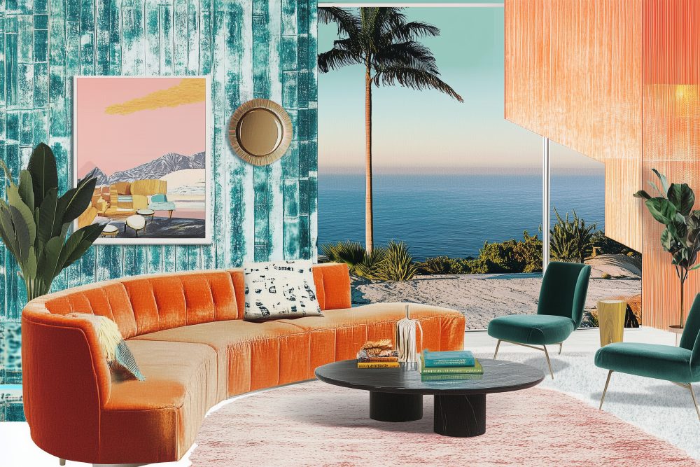
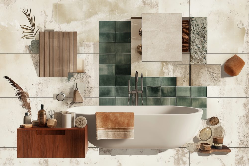
Mood boards are a crucial part of the design process, and probably the most creative one. With moodboards, designers translate abstract ideas into visuals that define the project’s overall feel and establish a cohesive mix of colours, textures, materials, inspirations and etc. Midjourney accelerates this process allowing designers to build out and present a visual concept easier and quicker than ever. This is especially helpful if a client has difficulty visualizing concepts or needs to see multiple options before moving forward.
2. Conceptual Design
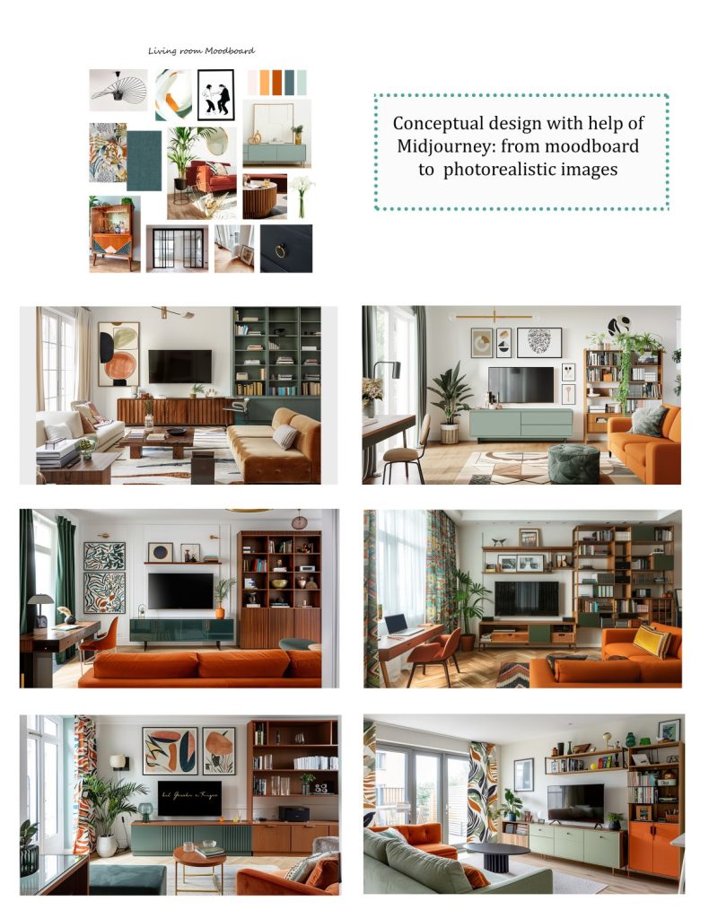
Using a mood board as visual reference, you can quickly generate room design concepts by adding text prompts. Each new generation and each new prompt iteration will offer subtle variations that bring fresh ideas to the design. The trial-and-error aspect of Midjourney is key here, as you refine prompts to achieve the desired look. One feature you will find really helpful at this stage is image weight parameter, which allows to adjust the importance of image references vs the text prompt. Once you’re happy with the results, you can show these to clients or use them for your own inspiration.
Below, you can see how I created a series of photorealistic living room concepts based off a moodboard, I´d previously put together on Photoshop.
3. Collage Work for Design Projects
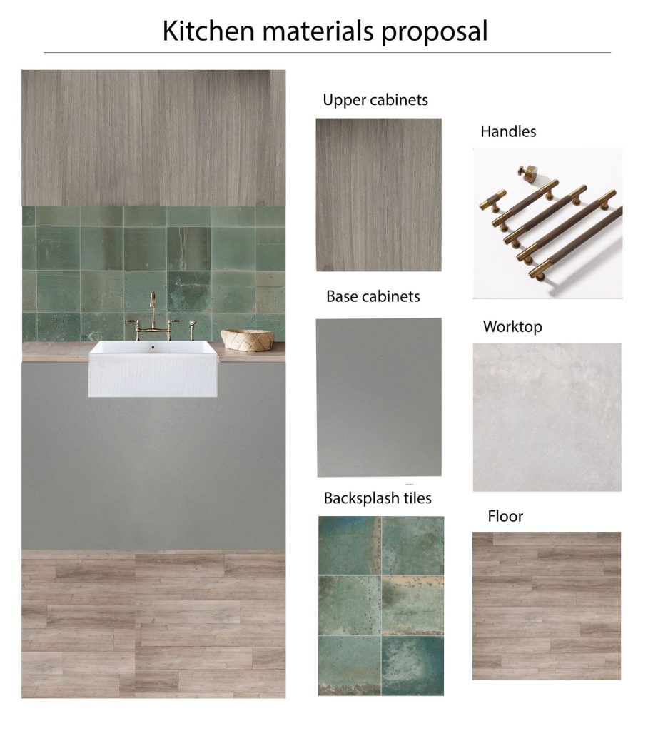
While Midjourney might not create an image that matches your idea down to every detail, it does a good job with the essentials. For example, if you need an image of something specific, like a front view of a kitchen with an exposed front sink, Midjourney can make it happen. Although you may still need Photoshop for fine-tuning. Personally, I’ve found this feature especially helpful with uneasy clients who don’t want to invest in full 3D renderings. In the example below, I was even able to upload into Midjourney the backsplash design I needed to be on the collage. And then I took the image to Photoshop, to add cabinet textures and flooring.
4. Content Creation
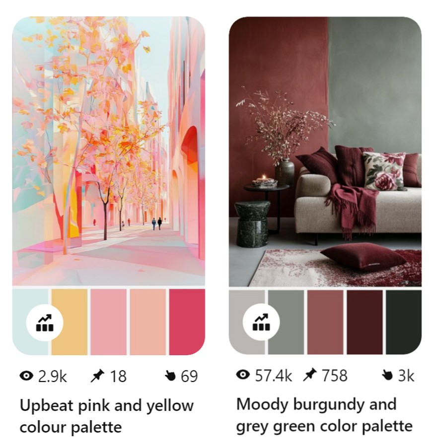
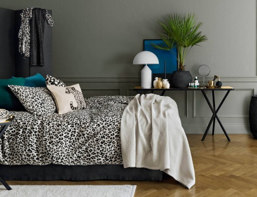
Most of the images in my recent post on the beige trend were created with Midjourney. and look how they are all different in style, featuring a wide range of materials, textures and shades of beige. With the right prompts, you can generate varied images for Instagram, Pinterest, or blog content. Speaking of Pinterest, here is a piece of insight. I’ve found that color palettes perform better on Pinterest than regular images. Also, if you look at the second pic below, remember I mentioned how Midjourney tends to match colours exactly? There you have it, the exact same shade of wine red on the throw, the rug and the cushion on the floor. A bit too matchy-matchy for a human designer, right?
5. Product Design
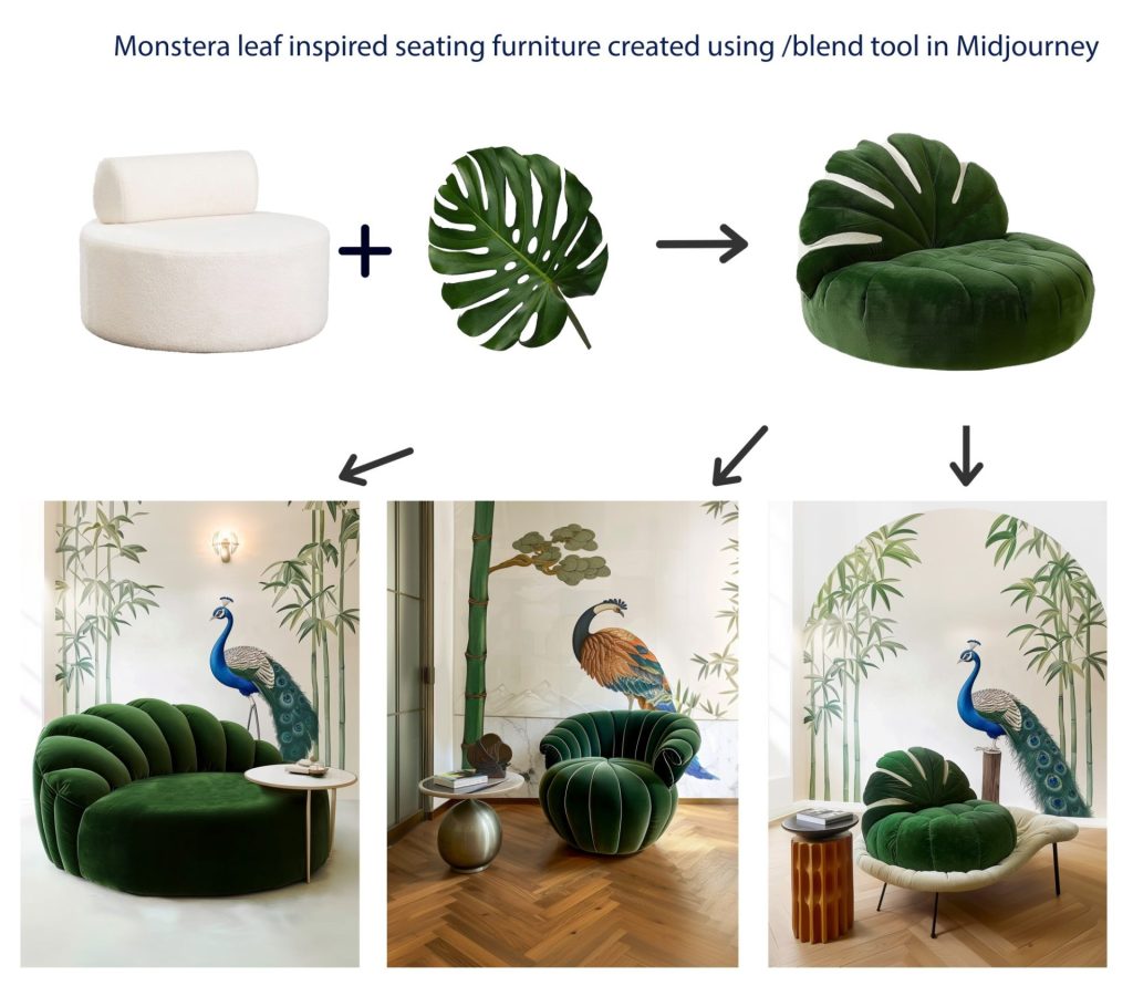
If you work with furniture manufacturers, Midjourney can help bring your creative product ideas to life. This way you can create unique and original items rather than copy existing designs.
Below, you can have a look at my experiments with a sofa inspired by the shape of a monstera leaf. And even when Midjourney screws you over, it can spark new ideas. Look at the third image, it no longer looks like a sofa, but it could be a swoonworthy cat bed, right?!
In Conclusion
These are my thoughts on using Midjourney for interior design. I hope you find them insightful, and if you haven’t explored image-generating AIs yet, I highly recommend giving Midjourney a try. Beyond being a valuable asset for your design workflow, it’s just a lot of fun!




2 Comments
Very useful guidelines on working with AI for interior design! I am very curious to find how it indeed works with colour as I often find with standard programmes that they excel in greys and beiges but fail at the full colour palette.
Also curious to see how you follow up with AI for actually searching and purchasing the actual materials.
Hello, I really appreciate your feedback! As for colours, matching exact colours can be achieved to a certain extent, but same with everything else, you do not have 100% control over it. I´ve read comments where people said they tried including RGB code or Pantone colour names into the prompt, and it worked for them. I think future versions of Midjourney will definitely offer more control over colours. Plus, you can include the desired colours into the image you can add to the prompt as “style reference”.
As for your other question, Midjourney is not integrated with any retailer data bases at this point, and I doubt it will ever have an option like “find me the exact same or very similar item in online stores” in the foreseeable future. This is something we will continue to be doing “manually” 🙂