

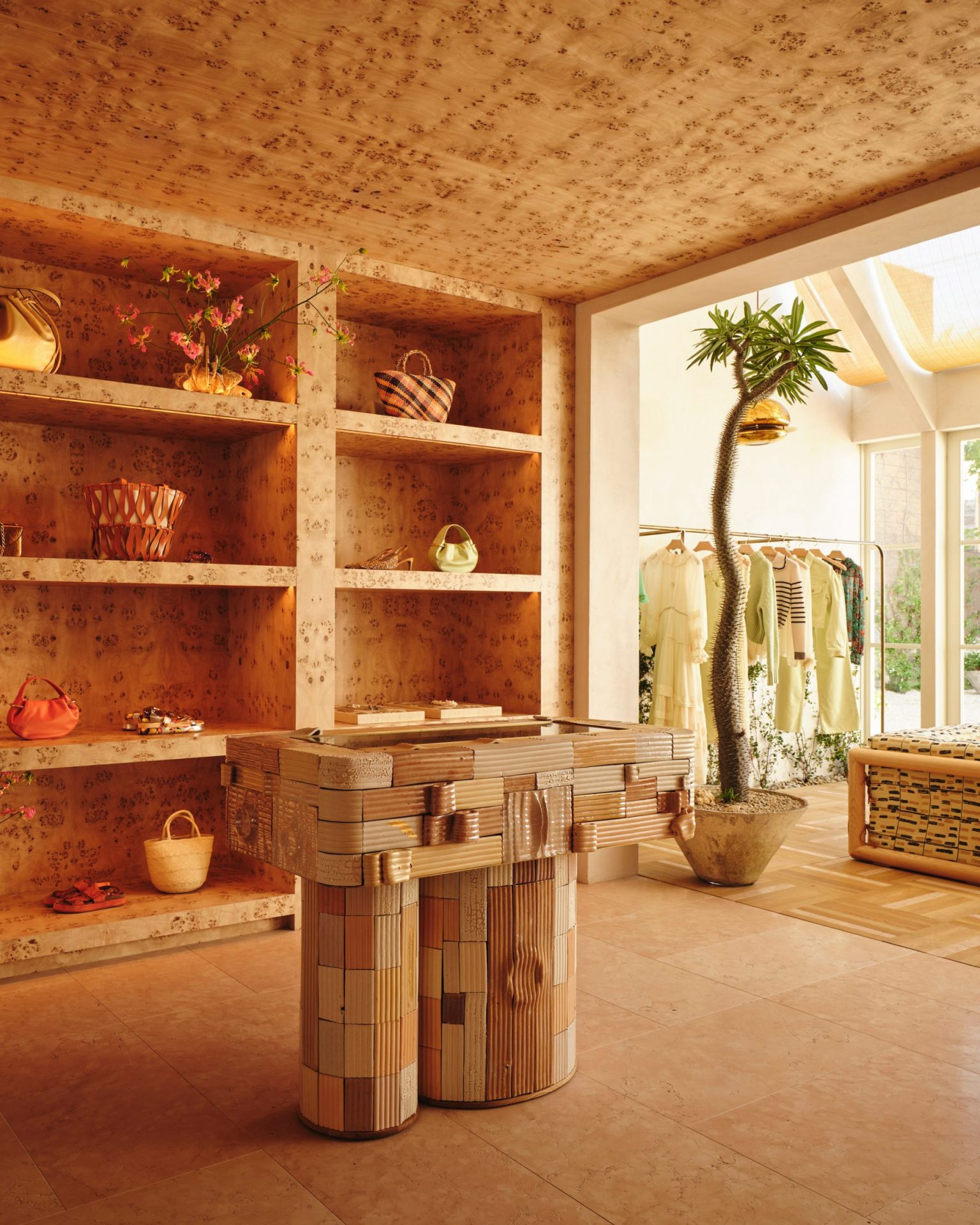
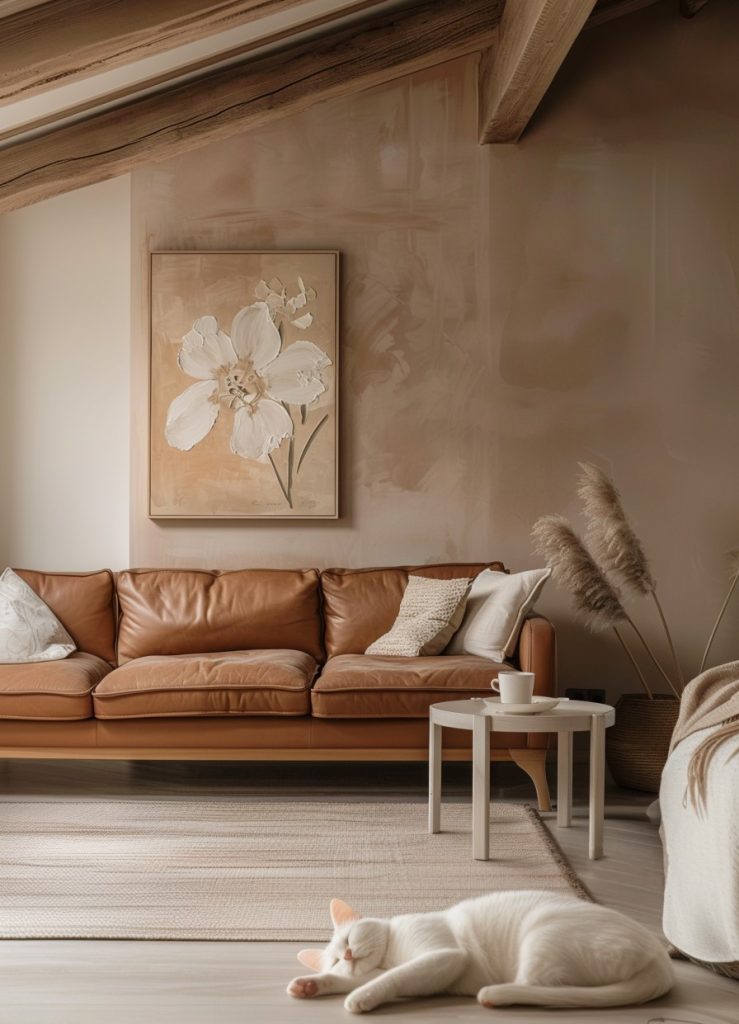
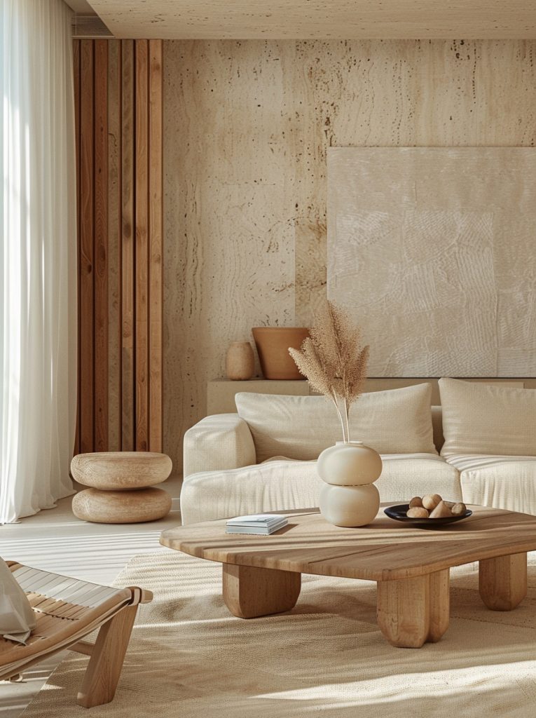
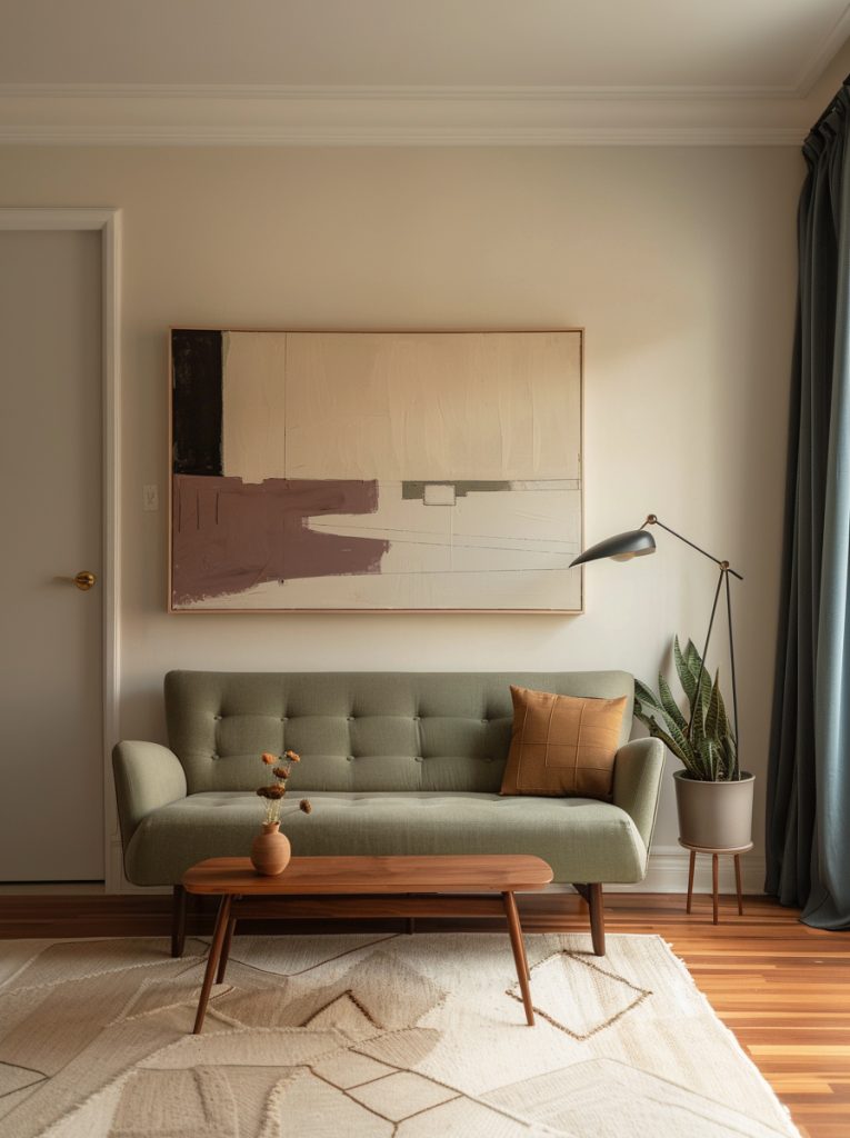
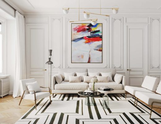
If you have been paying attention, you will know that earthy and beige tones are quickly driving out bold and colourful hues from both the stores and interior design magazine covers. Design icons like Kelly Wearstler or Patricia Urquiola are riding this new beige wave too, in a very creative and inventive way, as they should. Here, in Spain the beige trend first hit me at 2022´s Casa Decor. Then, one after another, local furniture companies like Zara Home or Kave Home began to dress their physical stores into different shades of beige. This was when I realized we are not getting rid of the beige anytime soon. One of these days I’m going to look into a broader context behind this trend, but today let’s just try to break down what makes beige a true champ in interior design.
Timelessness and Versatility
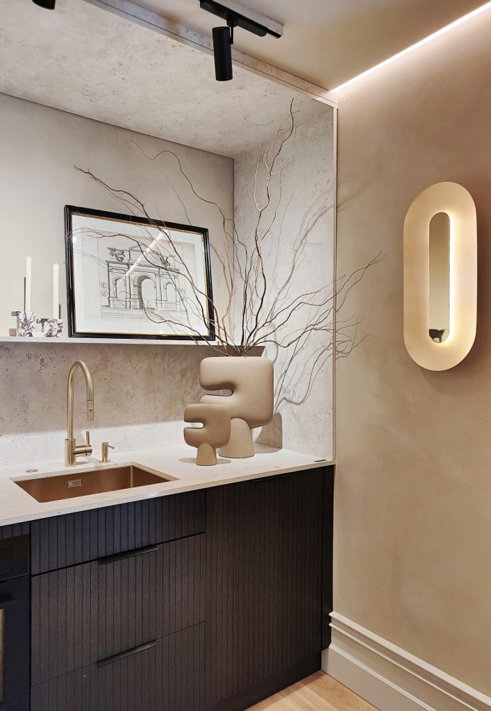
As such, neutral and beige colors are considered timeless due to their ability to fit into almost any design style, from modern minimalist to country or bohemian. They serve as a versatile backdrop that allows architectural elements and furnishings to stand out. This explains why they have become a preferred choice for designers who want to create spaces that do not require frequent updating.
Minimalist Aesthetic
Another thing adding to the popularity of beige is that it is a perfect fit for minimalism. Beige palettes complement this aesthetic perfectly by promoting a sense of calm, order, and understated elegance. These colors help in creating clean, uncluttered spaces that emphasize simplicity and functionality.
Reselling Factor
Let us not forget that beige tones are not only stylish, but also marketable. Neutral colors are generally more appealing to a broader audience, enhancing the resale value of a home by appealing to potential buyers who may have varied tastes.
Psychological Impact
Neutrals and beiges are associated with tranquility, stability, and harmony. As wellness becomes a more prominent theme in interior design, colors that help create a peaceful and restorative environment are increasingly favored. This psychological impact influences editorial choices, aiming to reflect and promote interiors that contribute to well-being.
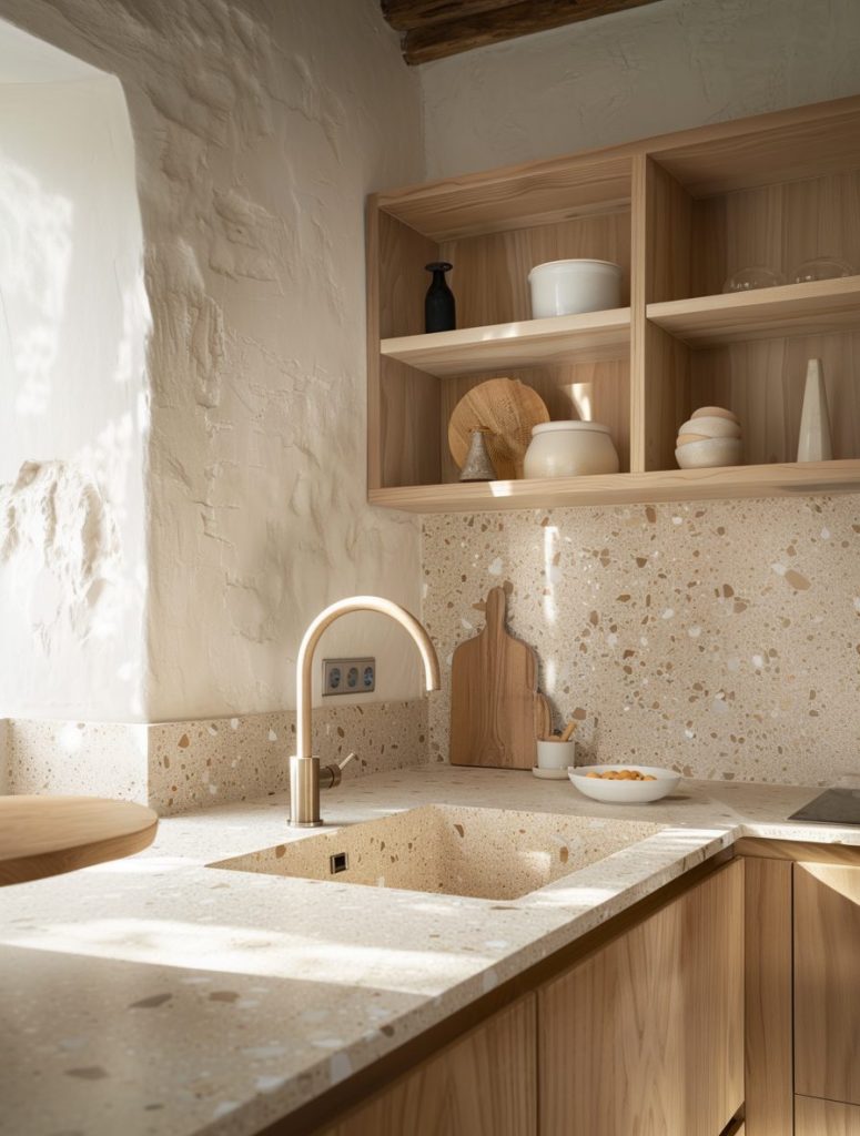
Influence of Natural Materials
The trend towards using natural materials like wood, stone, and linen also adds to the popularity of neutral and beige tones. These materials often come in various shades of beige and brown, and using a similar palette on walls creates a cohesive look that is aesthetically pleasing and grounded in nature. Translated into the language of colour, the growing emphasis on sustainability, another global trend to be reckoned, means green and beige.
Global Trends and Influences
With global influences becoming more pronounced in interior design, there’s a convergence towards styles and palettes that transcend regional preferences. Neutrals and beiges are globally accepted and integrate well with various cultural elements, making them a popular choice across all styles of interior design.
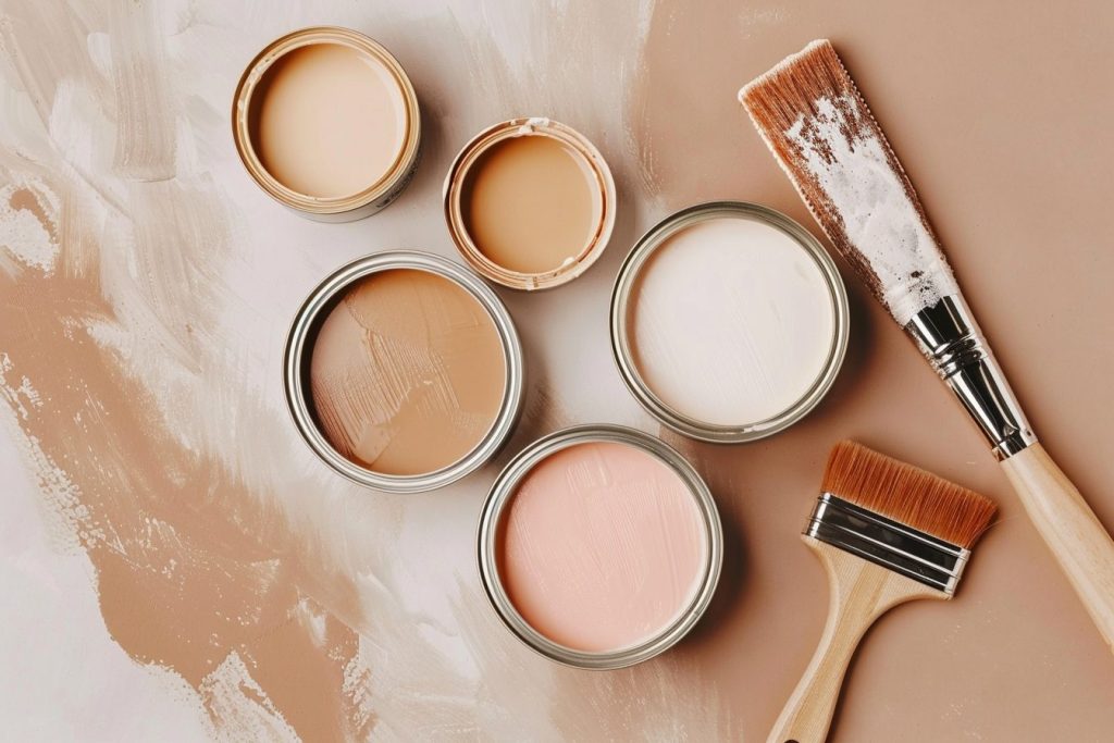
What I am trying to say is that beige trend is here to stay. That seems to be a fact. Colour lovers like myself should try to find ways to integrate it into our homes/design projects, because retailers will be offering us an increasingly wide choice of original and beautiful furnishings and materials in beige colour. Tile makers are mixing patterns, textures, styles and shapes like crazy. This means that “neutral” is no longer a euphemism for plain and boring. At the same time, paint companies like Farrow & Ball or Benjamin Moore have curated a very intricate beige palette so you can find that perfect shade of beige for your walls.
Speaking of paint, here are a few things to keep in mind when choosing beige paint.
- Lighting Conditions: Before deciding on a shade of beige, observe how the light in your space changes throughout the day. North-facing rooms may benefit from warmer beiges to counteract the cooler, less direct light. Meanwhile, south-facing rooms with ample sunlight might handle cooler, subtler shades of beige beautifully.
- Undertones: Beige isn’t just a single color but a spectrum with various undertones—pink, yellow, green, or gray. These undertones can profoundly affect the feel of a room:
- Yellow undertones bring warmth and coziness, making them ideal for living rooms or northern exposure rooms.
- Pink undertones can make a space feel softer and are particularly flattering in settings with natural light.
- Green undertones help in spaces that aim for a natural, earthy vibe.
- Gray undertones (greige) are modern and neutral, providing a contemporary look that pairs well with both warm and cool accents.
- Room Size and Ceiling Height: Lighter shades of beige can make a small room feel larger and more open, while darker beiges can make a large room feel more intimate and cozy. Similarly, if you have low ceilings, a lighter beige can help make the ceiling appear higher.
- Paint Finish: The finish of the paint can affect the perception of color. Matte or flat finishes absorb light, minimizing the impact of the color’s undertone. On the contrary, glossier finishes reflect light, enhancing the color and making the room feel lighter and brighter.
- Sample Testing: Always test paint colors in the intended environment before making a final decision. Paint large swatches to see how the color looks at various times of the day and under different lighting conditions. This test can help you see the true color and its compatibility with the space.
- Overall Atmosphere: Consider the overall atmosphere and aesthetic you want to achieve. Beige can range from casual and comforting to sophisticated and refined, depending on the chosen shade and room’s decor.


No Comments