


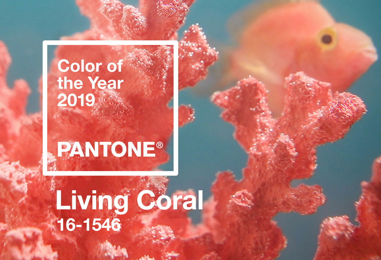
 So Pantone has announced that the colour of 2019 will be Living Coral. I’m really not sure where they draw these predictions from, but this time I really dig their selected colour, which is basically coral pink. I recently introduced some pink, a different hue though, in my living room. I’ve always loved pink, and the variety of shades of pink is pretty amazing. In the recent years, especially since Pantone named Rose Quartz one of the Colors of 2016, pink has taken the limelight, thus, there was a real pink invasion at this year’s Casa Decor exhibition.Let’s take a look at some of the most popular, yet very different shades of pink.
Coral Pink
According to Pantone, Living Coral is «an animating and life-affirming coral hue with a golden undertone that energizes and enlivens with a softer edge». Coral hues can be more orangey, but personally I prefer the lighter and pinker shades, they really transmit this pure and energetic sophistication.
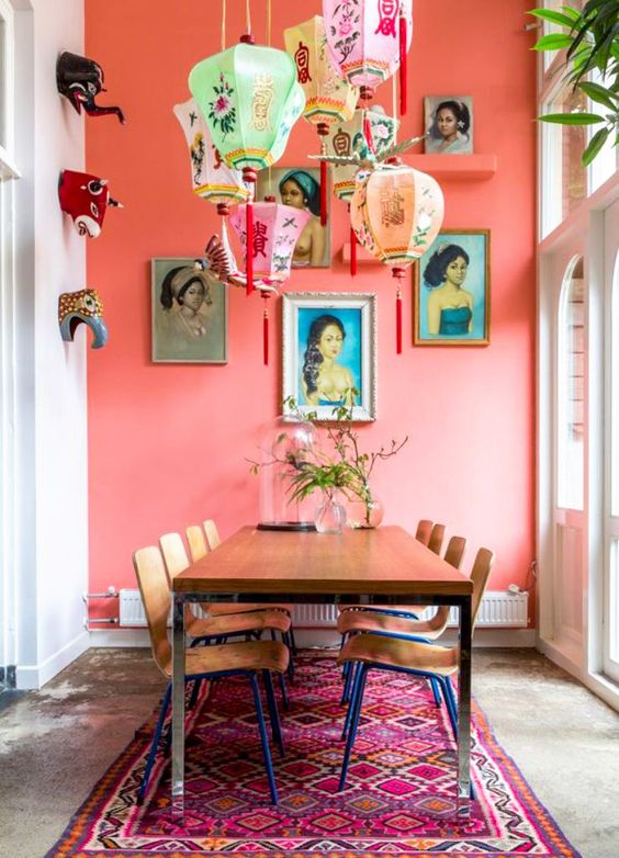
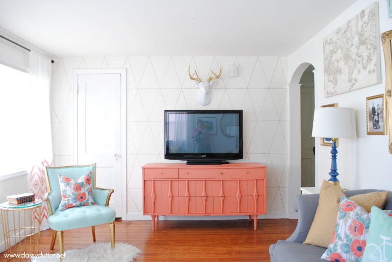
Photo: Classy Clutter
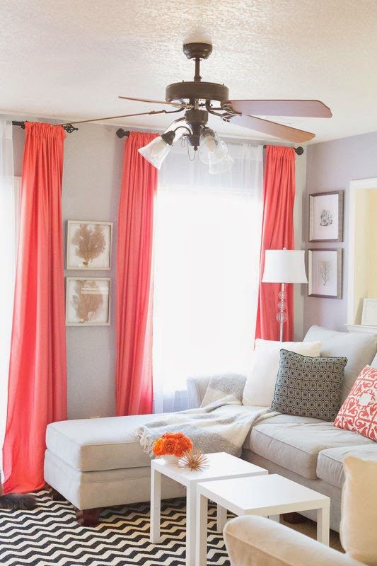
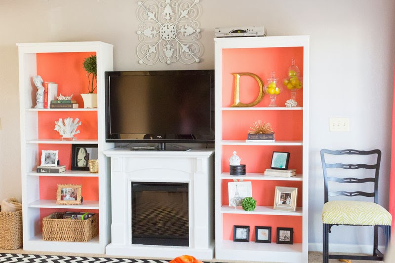
Photo: Darling Daly Design
Hot pink
Another popular and brighter shade of pink is hot or fuchsia pink. It’s sassy, shiny and glamorous, always looking like a rather bold design statement.
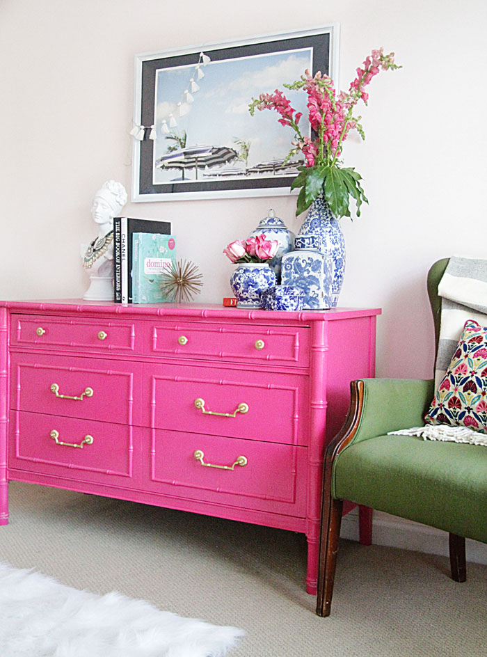 Photo: Style Your Senses
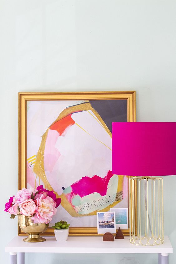
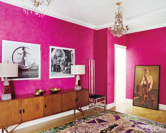 Photo: Elle Décor
Bubblegum Pink
This pink color is uncompromisingly feminine, playful and flirty. Maybe you will have a different opinion, but this is the shade of pink I have in mind when I hear Aerosmith’s timeless classic «Pink is my new obsession!» I have a feeling that these days such «girlie» pink is kind of chastised as too straightforward and kitsch,
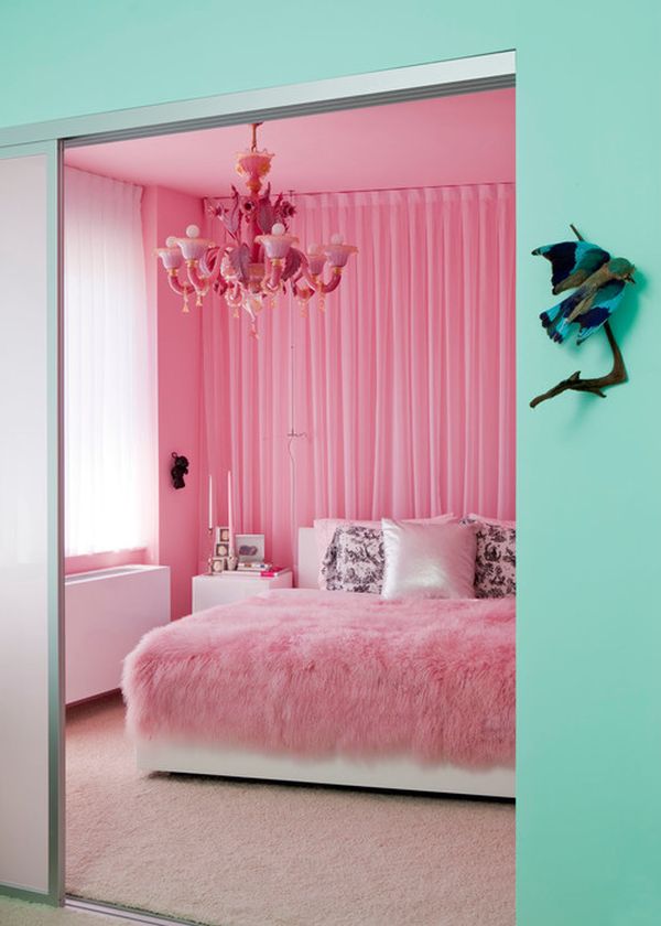
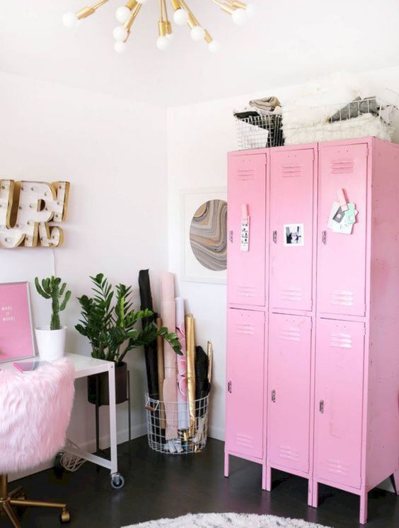 Photo: A Beautiful Mess
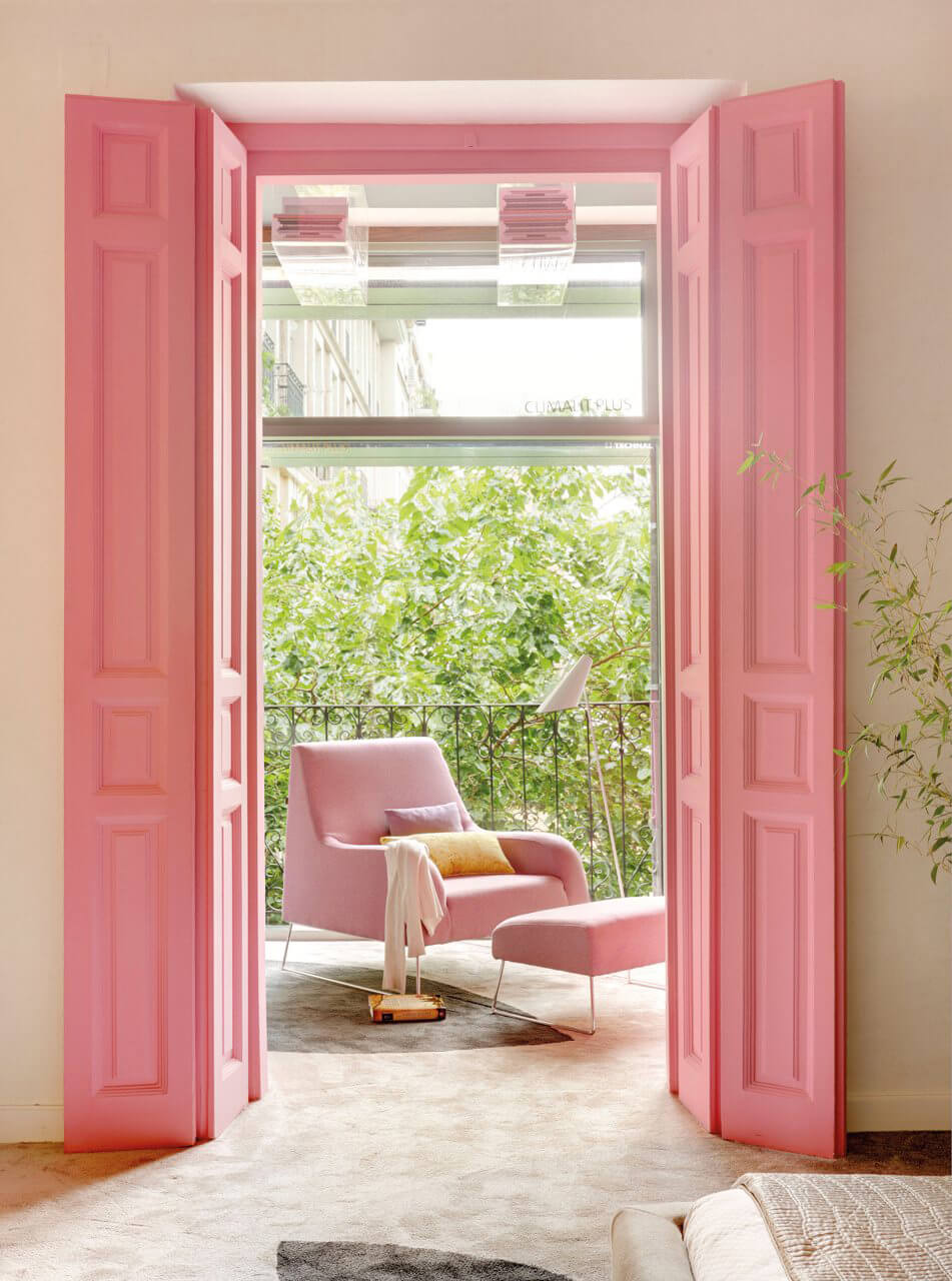
Photo: Emily Henderson
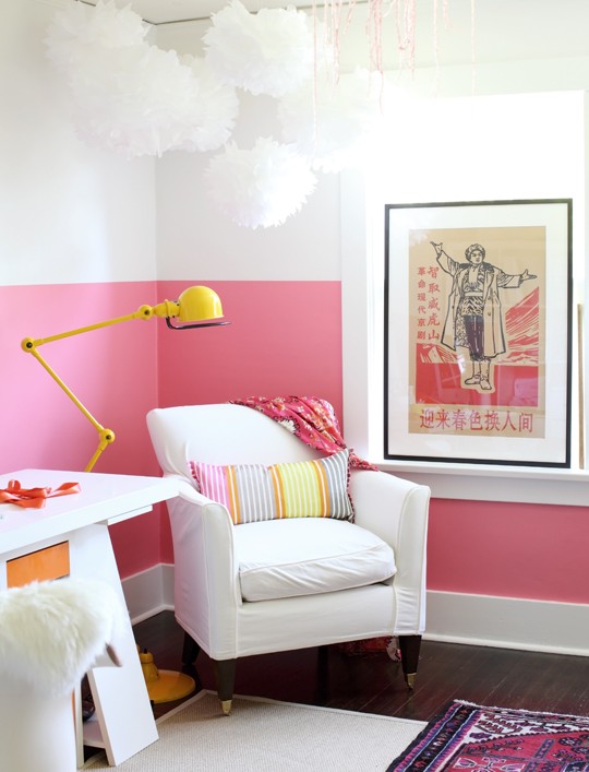 Photo: Pinecone Camp
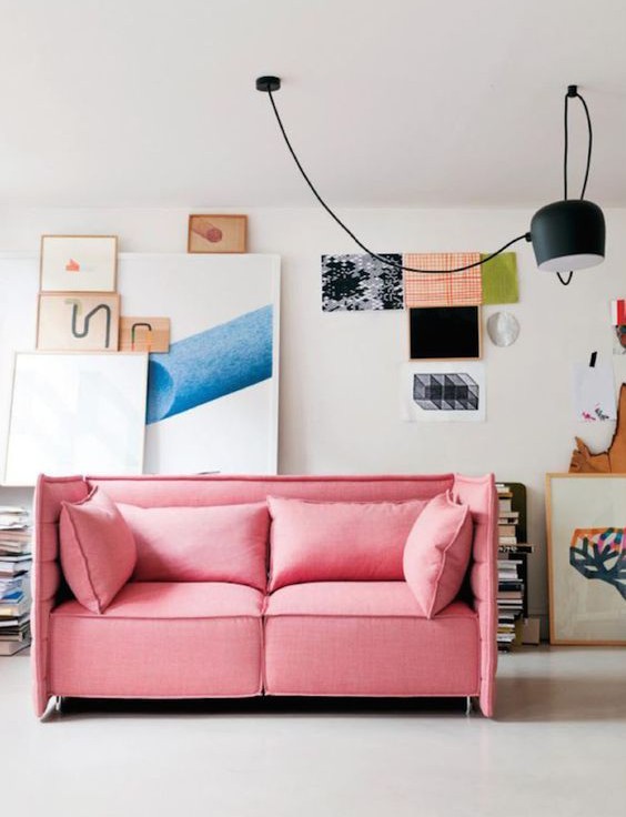 Photo: SmartFurniture
Blush pink
This has to be one of the most gender-neutral tones of pink, besides, it has a calming and relaxing effect, hence its overwhelming popularity. You see blush pink a lot in combination with richer and darker tones of green and blue, but no less frequently it is paired with subtle tones of grey and white.
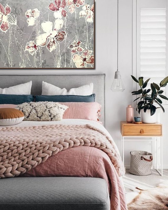 Photo: Etsy
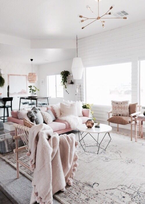 Photo: Decoratio
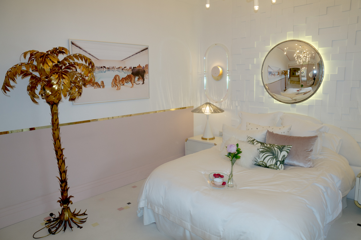
Patricia Bustos’ Palm Springs inspired suite from Casa Decor 2017
Peach pink
This pastel tone of pink is warm and delicate. For me, it feels like spring itself, transmitting some sort of a fresh start and hope. This hue is perfect for nurseries, don’t you think?
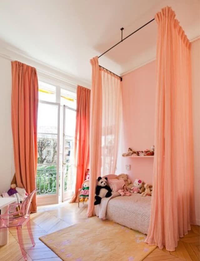 Photo: Apartment Therapy
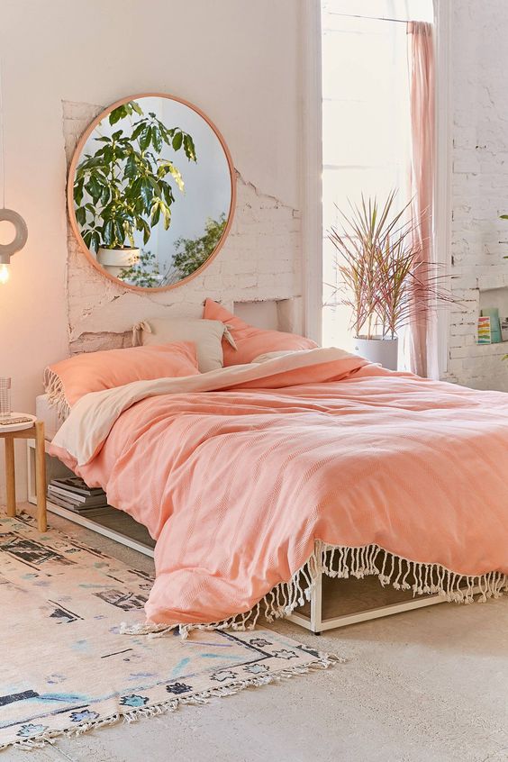 Photo: Urban Outfitters
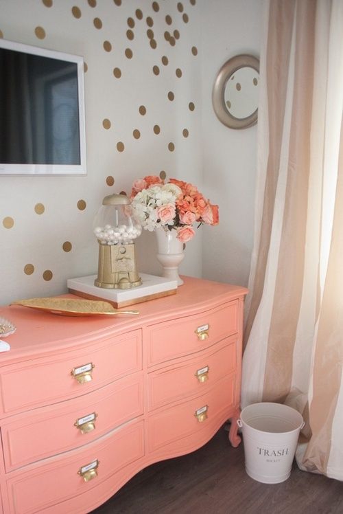 Photo: El Taller de lo Antiguo
1 Comment